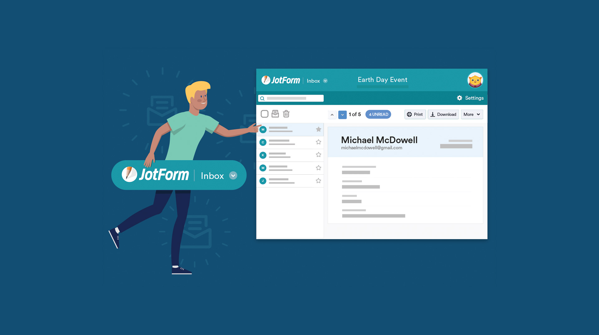
Jotform Inbox
CASE STUDY
UI/UX
COMPANY
Jotform
DISCIPLINES
User Experience
User Interface
User Research
Product Ownership
Jotform is a full-featured
Online Form Builder
That makes it easy to create robust forms and collect essential data without writing a line of code. Trusted by over 15M users worldwide, such as nonprofits, educational institutions, small businesses, and enterprises,

15M
Users and more

20M
Forms hosted

10K
Form Templates

Responsible for user research with the UXR team, user experience design, wireframes, visual design, interactive prototypes, and leading the team of developers with the ownership of the product.

Our primary role was simple: change how users search, organize and manage their form submissions with a proposed design solution and validation.
Problem
More than 15 million users use JotForm. That leads us to different kinds of customers. When I joined the company, I empathized with users and saw problems on the old submissions page. We interviewed our users and identified different problem statements to define these problems.

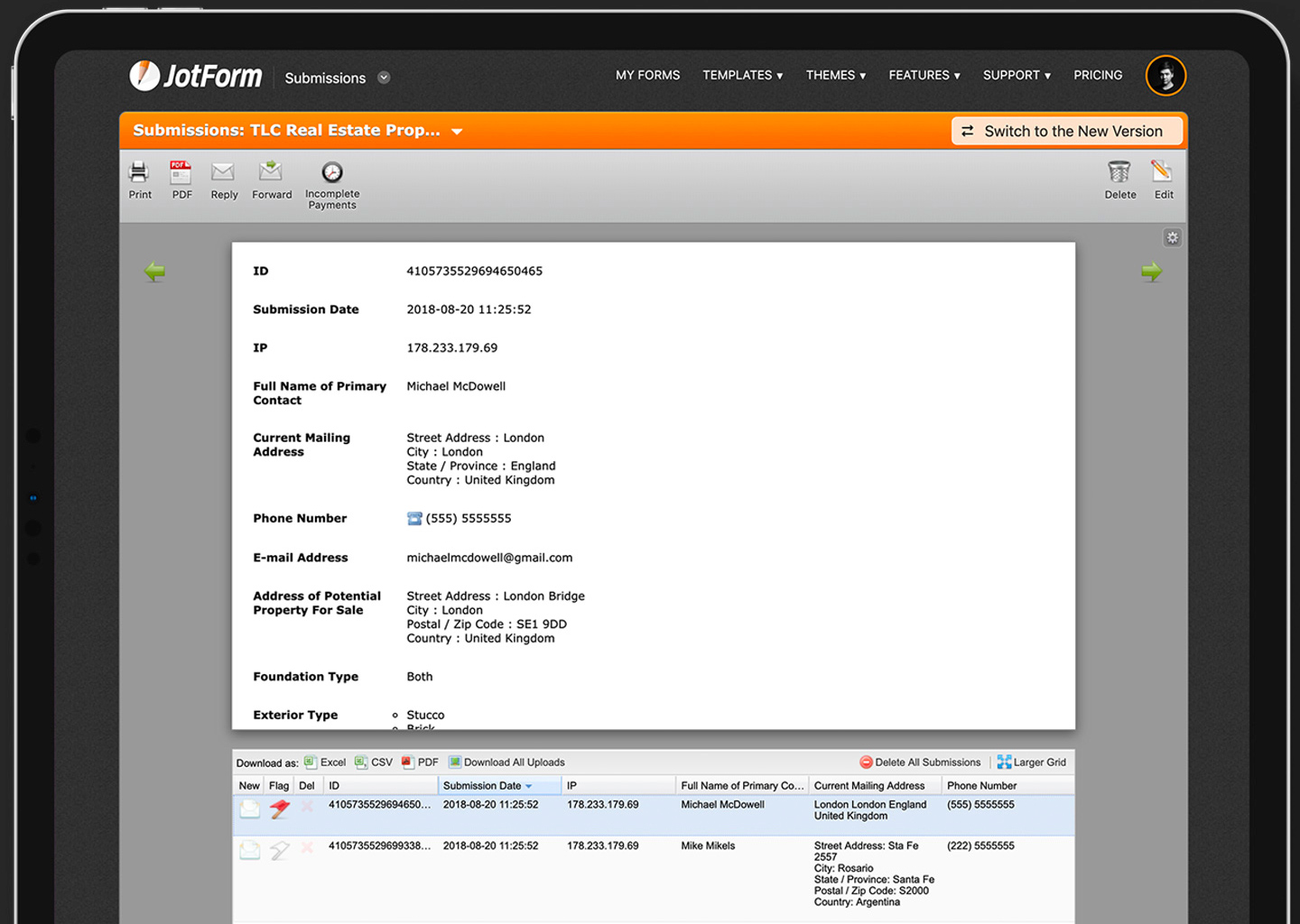
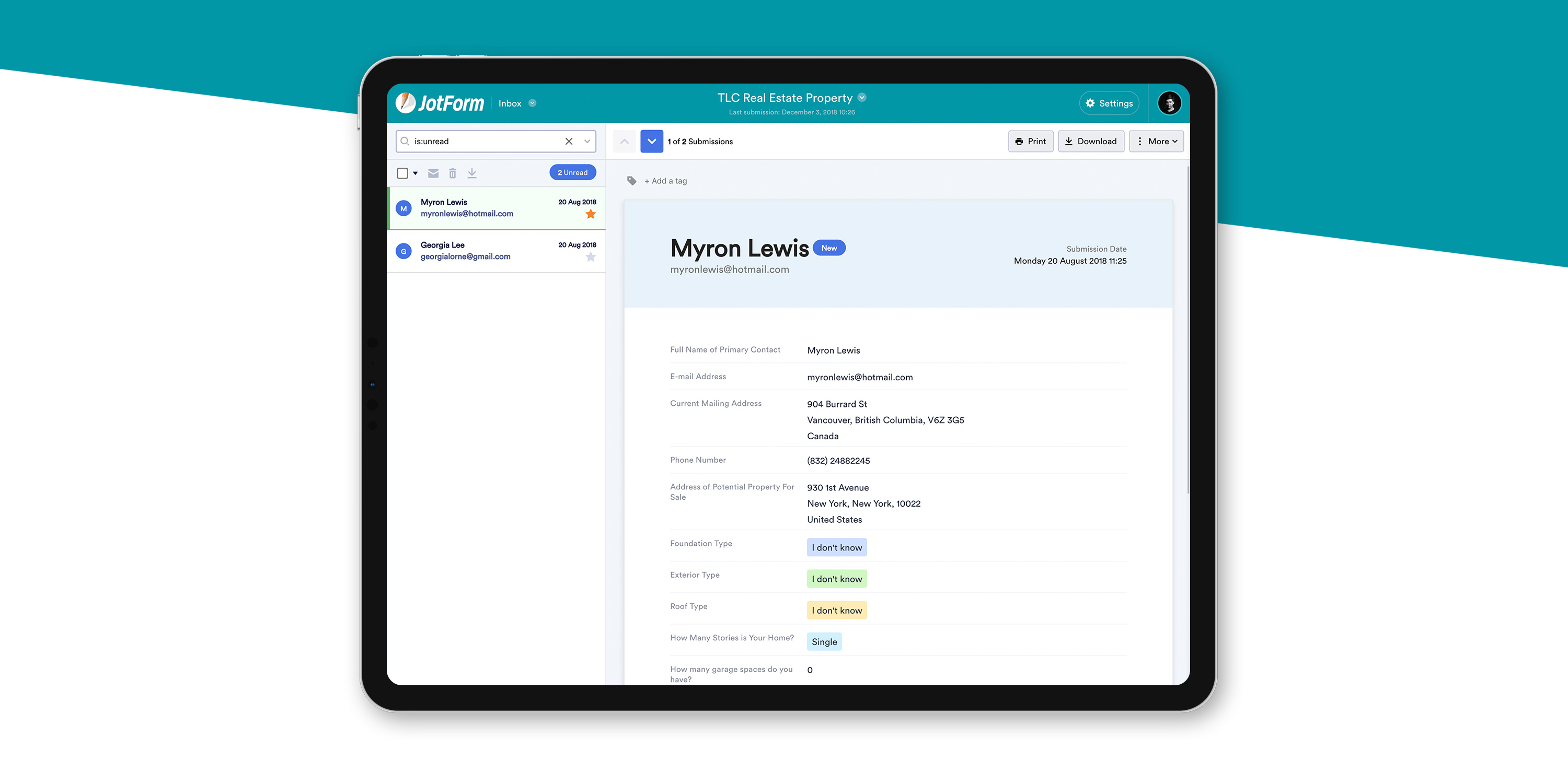
Old Submission Page
Difficult to see the list
Hard to search in submissions
Hard to differentiate unread submissions
There is a flag button that has a negative state
Hard to understand the new submissions
Printing a document is a problem
Bonus: Users want to change their question order to see what they need immediately.
They want to change their question order and separate it from the form layout.

Outcome
After conducting many user interviews, usability tests, and tracking various metrics across the board for quite a while, with the help of a complete story that we can see users' behaviors, it was clear that the experience of seeing a submission was essentially time-consuming and not responsive at all, which lead to looking at only the notification emails. When sharing these concerns with the stakeholders and CEO, they gave the green light to work on this project.
Define
User Overview
In building Jotform Inbox, our user research team and I interviewed several beta users to learn how they incorporated submissions into their workflow. We discovered a diverse collection of organizations using Jotform forms in entirely different ways but bound by a single need: to see and manage data efficiently.
- Marketing Managers: to support marketing efforts.
- HR Managers: to simplify the hiring process.
- Sales Representatives: to keep track of orders.
- Supporters: to collect feedback data and monitor.


Findings
At this stage, we did a bit of brainstorming and came up with a few ideas to resolve the issues uncovered during my interaction with the users at the interview stage. We’ve built features in our new Inbox tool to provide several different types of user profiles:
- Users who want to see their submissions on various device
- Users who take out their submissions print away
- Users who wish to collect, tag, and monitor their data easily
Design Strategy
Although Jotform Inbox was born out of a desire to improve our old submissions page, conversations with people who used our product prompted us to rethink our approach. Therefore, I established our design strategy on these three pillars:
- Aim for a low barrier of entry and learning curve by increasing the discoverability and findability of features and utilizing progressive disclosure.
- Achieve consistency by standardizing interaction patterns and creating a UI Framework.
- Allow people to see submissions anywhere, anytime so that reading submissions can become an essential part of the daily workflow, like spreadsheets or word processors.

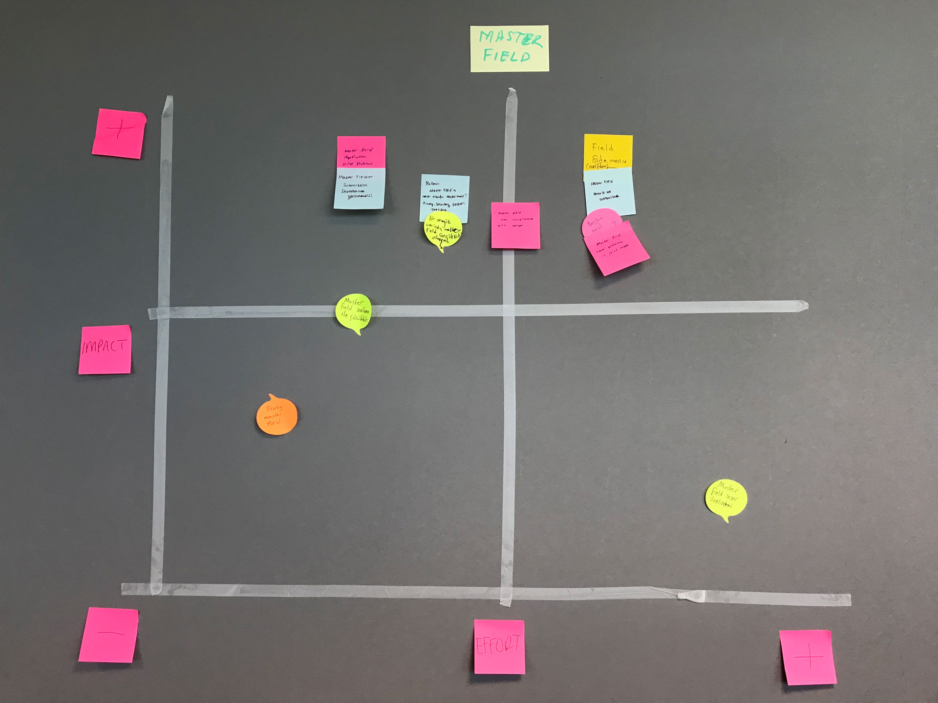
Ideate
01
User Journeys
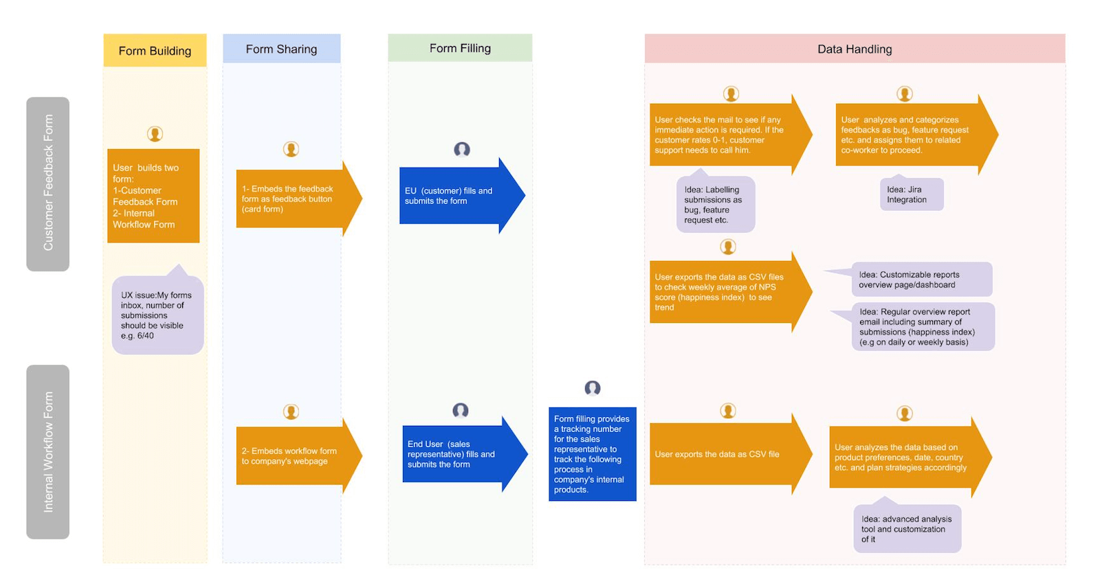
Based on their sharing, two simple user journeys to map their process of reading data and taking action on the data. These journeys we use it for further understanding their hard time doing it. Some observations from their behaviors when performing tasks in these flows and their feedback defined their pain points.
02
Proposed Solutions
Straightforward as it sounds, solutions come from reasons. Solving submissions lists straight to the point as users feel pain because they cannot find submissions easier.
As users know the time, they could read the submissions purposely and add some sort of new read/unread visual to make submissions more seeable.
03
Wireframes
At this stage, we still limit our focus to the flow and functionality of the product while also including some interface details to give more clarity to the purpose of each screen. This allowed us to rapidly test and improve ideas with actual user tests before designing the interface properly. To do this, we also tried to include this product in the new Tables project.
04
User Testings, Feedback & Iterations
After testing the wireframes with a different set of users and making a few notes which were primarily reflected in the high-fidelity designs except the whole idea itself, the critical updates made to the design are based on the feedback and observations made while testing the wireframes.
User testing and feedback showed us that we're on the right path to focusing on the new product idea and design.

Make reading easier.
Familiar look.
Speeds up workflow.
Easy to skim.
Simple search.
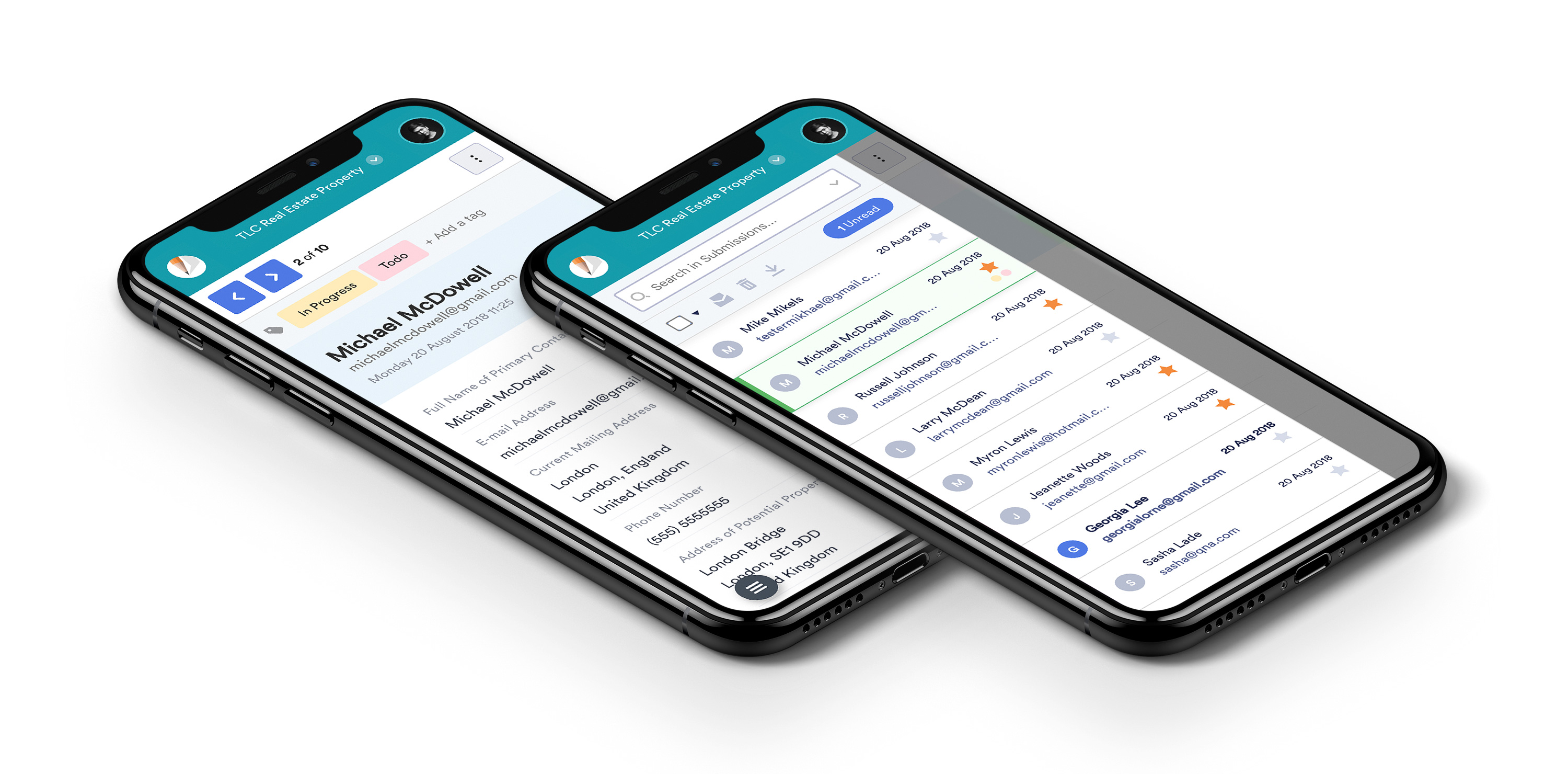
Mobile compatibility.
Elegant look.
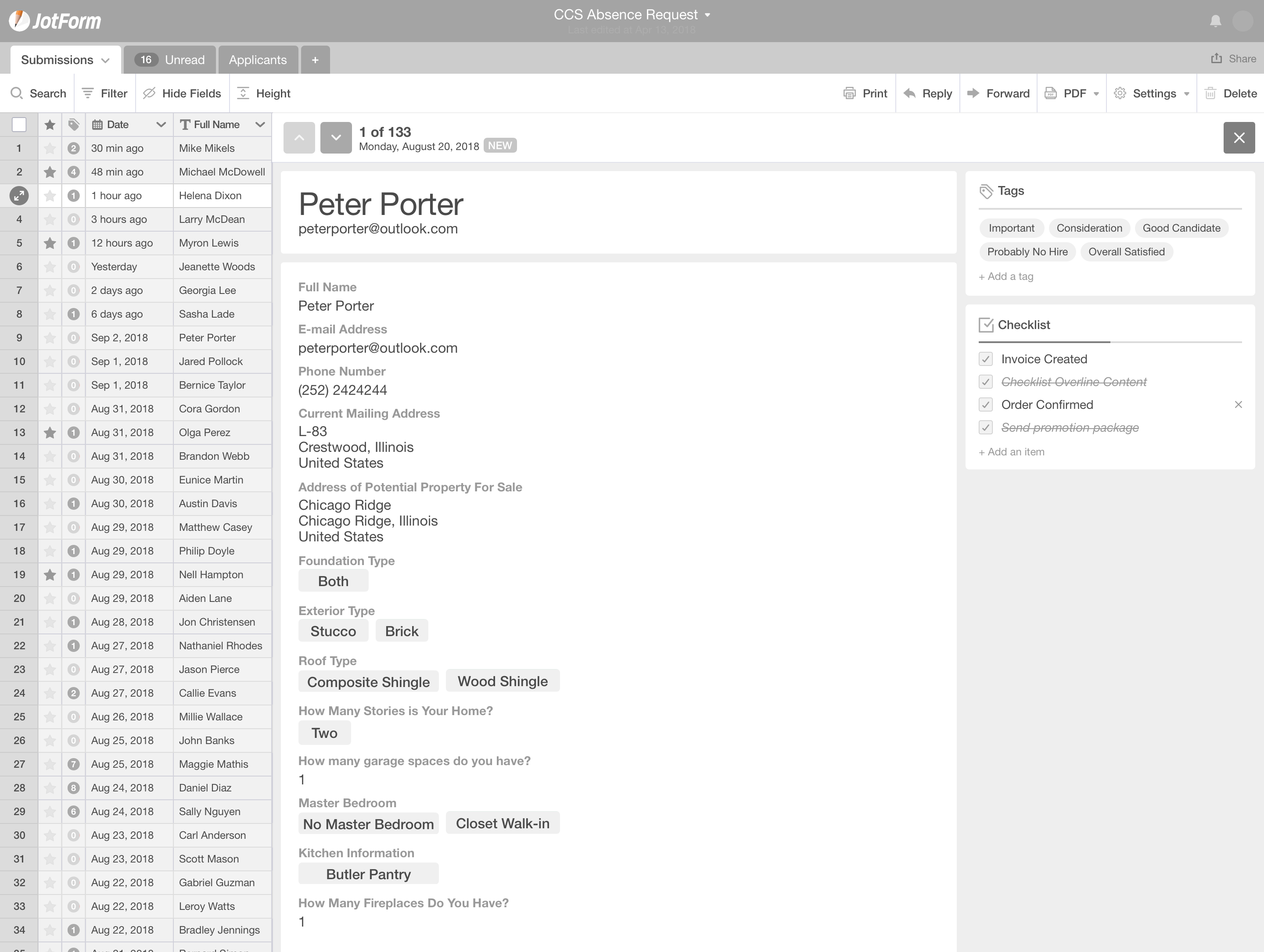
Make Reading Easier
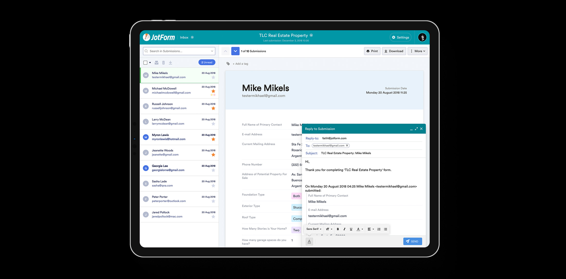
A new design of the submission view reading area is like a paper to make reading easier.
Familiar Look
There is a shallow learning curve to using the new product; it mirrors an email inbox, which makes the UX feel familiar to users.
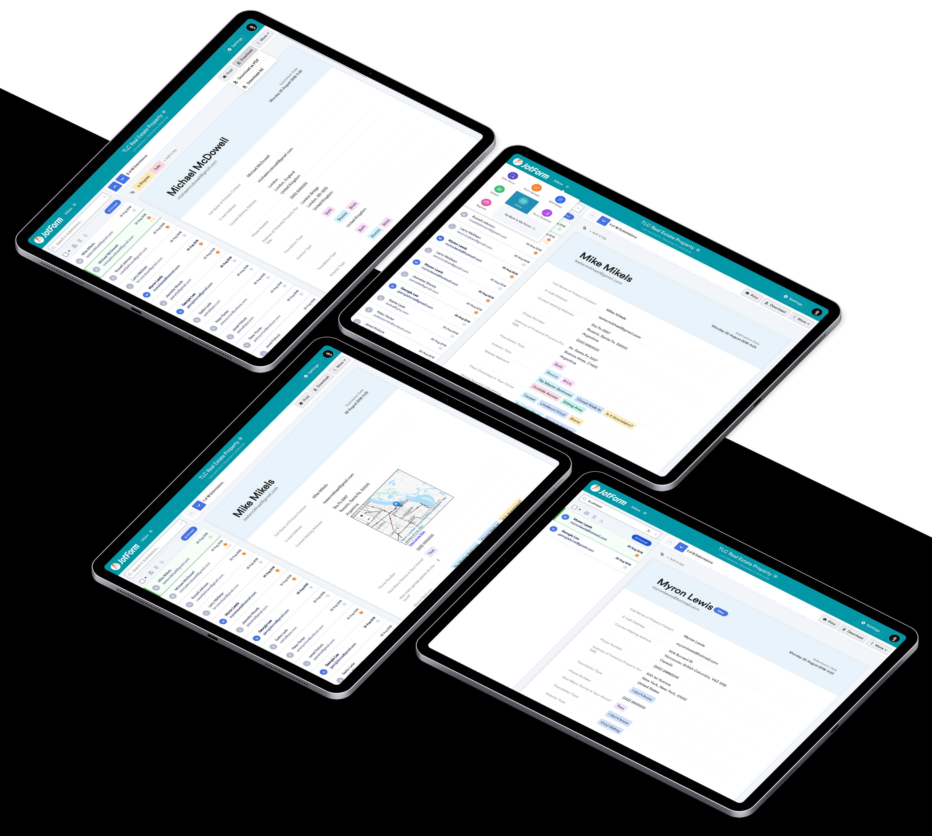
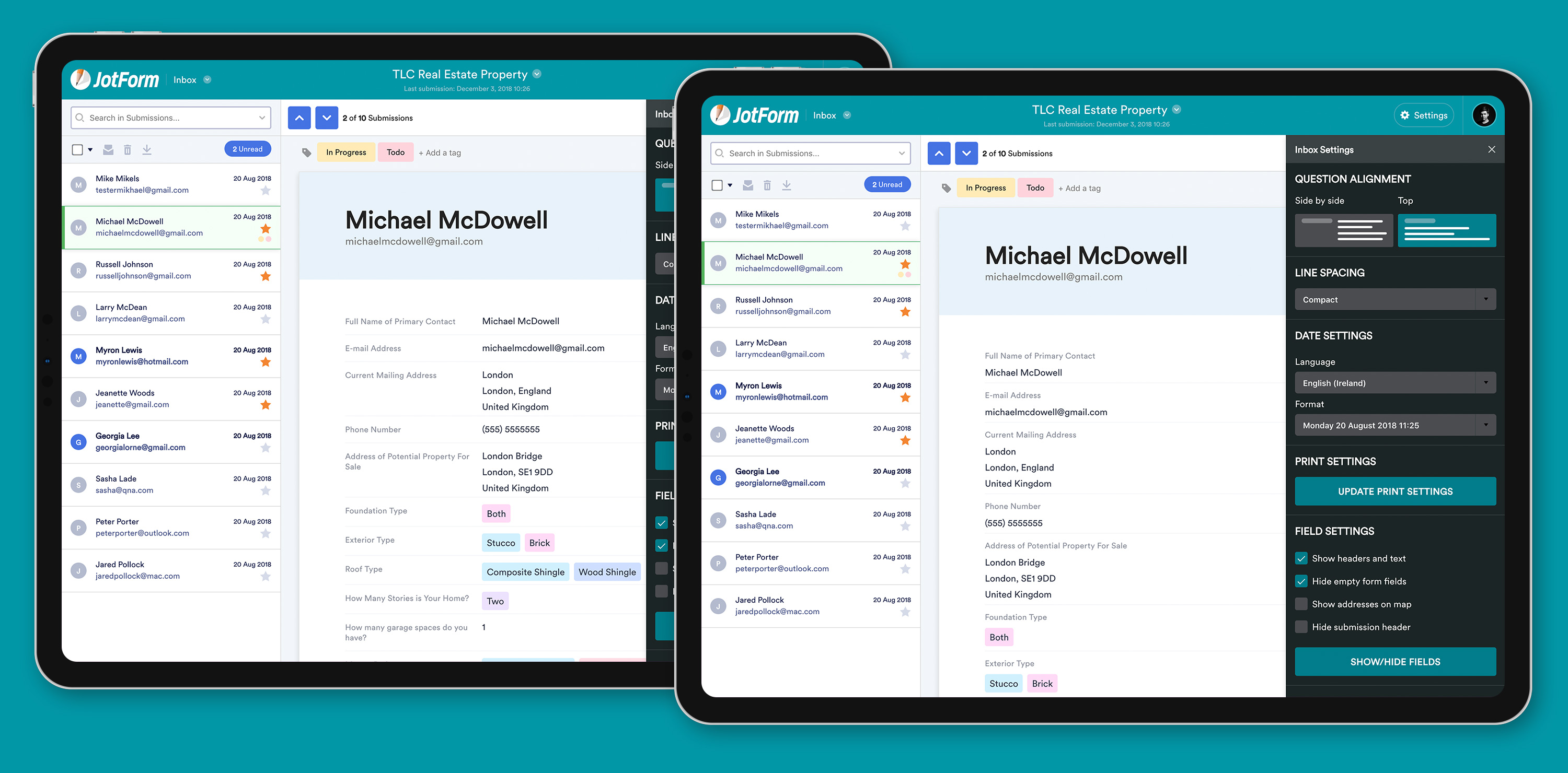
Mobile Compatibility
Users can quickly check their inboxes on a mobile device or tablet and access the same features they have on a desktop computer.
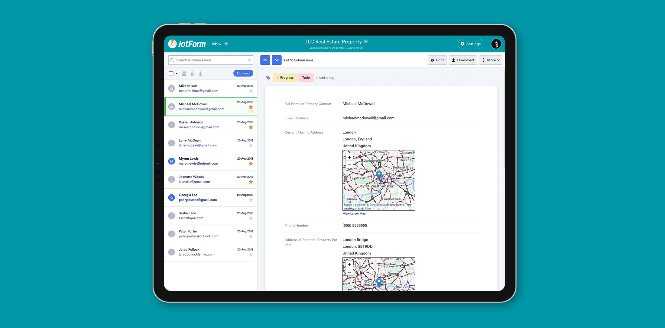
Easy to Skim
This tool allows users to scan and skim their submissions easily.
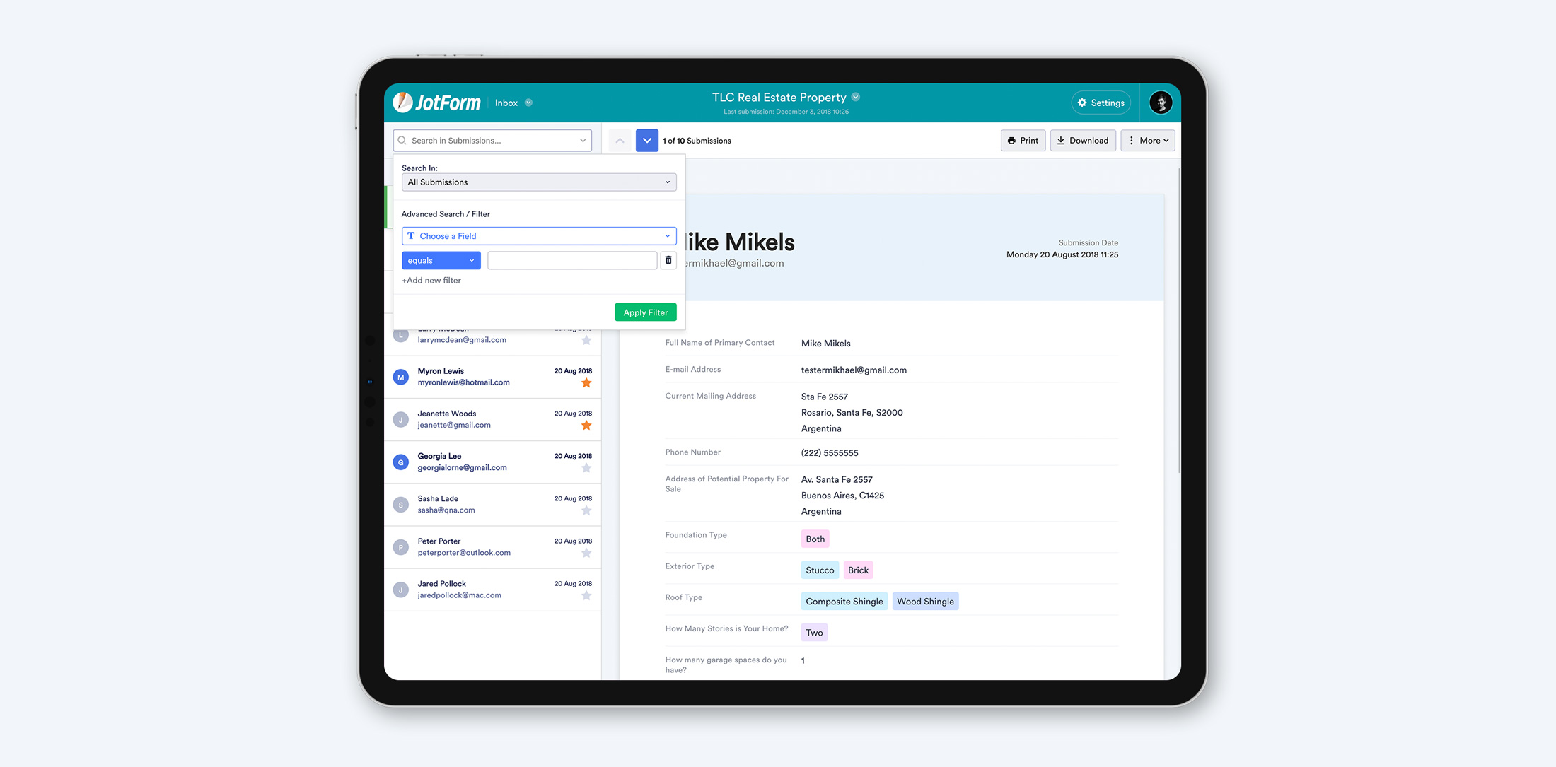
Simple Search
Users can effortlessly search for and find specific submissions with zero hassle.
Speeds Up Workflow
Users can flip through each submission and see them at a glance.
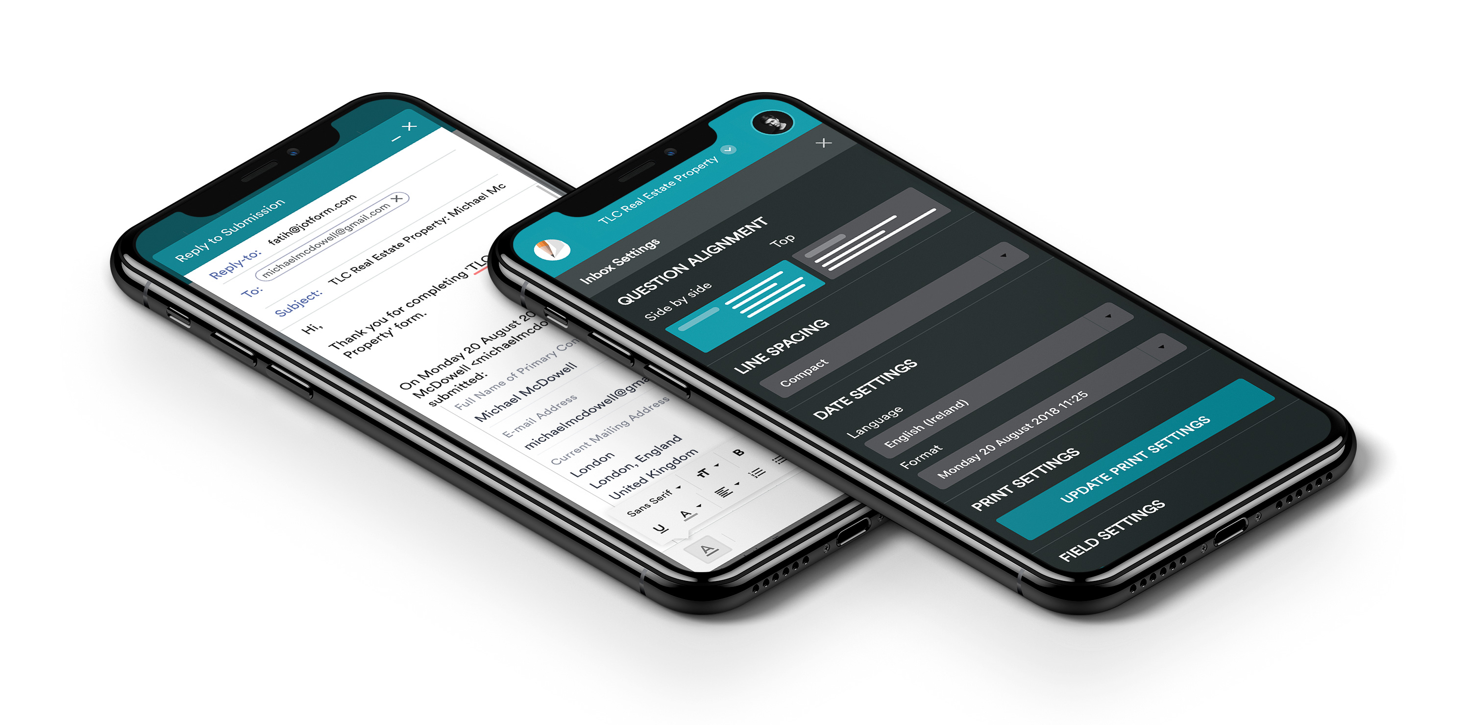
User Interfaces
Key Takeaways

To support marketing efforts
Christian Clansky directs a marketing department at a nonprofit Independent Sector, and his team uses JotForm to collect applications for event programming, webinars, and more.
“I really like the fact that I can scroll through all the submissions instead of trying to click. The design and UX are great. What I like the most is that it mirrors an email inbox — it’s intuitive and functions familiarly. Everyone on my team would know what to do here.”
— Christian Clansky, Independent Sector

To simply the hiring process
Hiring can be a pain with tons of applications to sift through and vet. But one of our HR director users, Darren Brooke, from Clay County, Minnesota, has figured out a way to streamline this process.
“The new tab is better for seeing every submission in one quick way. It’s nice to see how many applicants we get.”
—Darren Brooke, Clay County, Minnesota

To keep track of orders
Taking orders and receiving payments isn’t easy unless you have a powerful tool to rely on. Peyton Ortiz is a manager at Active RV Upholstery Center, and she oversees her company’s orders and collects customer information.
“I rely on Jotform Inbox when I need to pull up information quickly, saving me from spending time searching for submissions. I also love the spacious and clean look of Jotform Inbox.”
— Peyton Ortiz, Active RV Upholstery Center
[email protected]
Amsterdam, Netherlands