COMPANY
Rakuten
DISCIPLINES
User Experience
User Interface
User Research
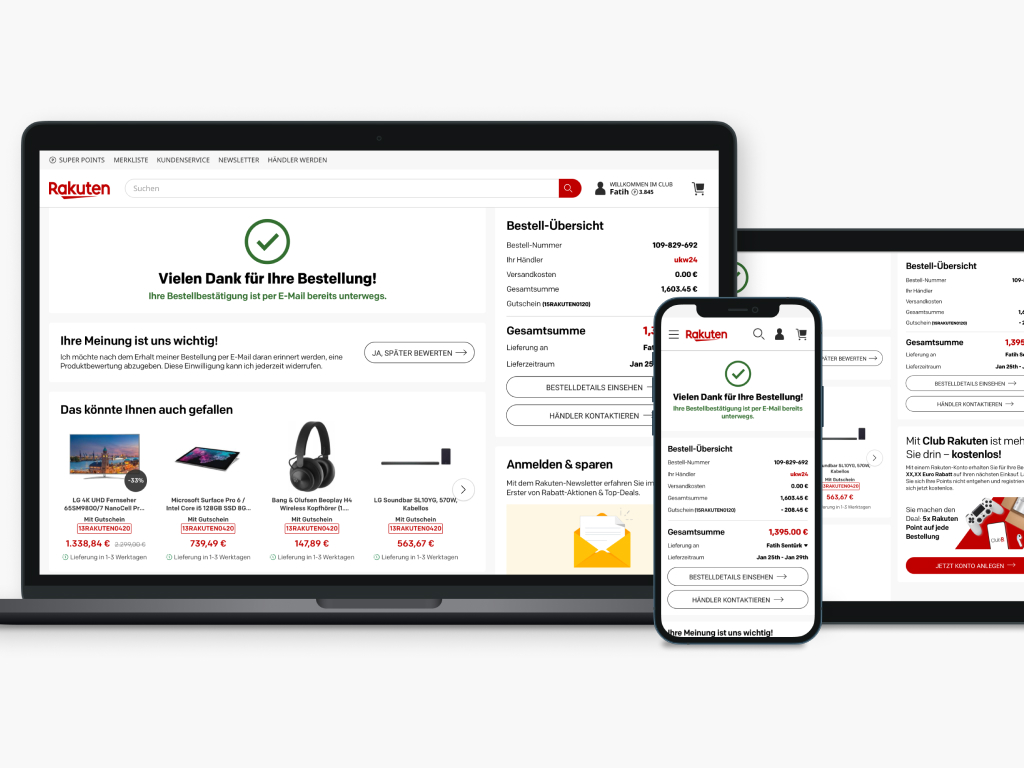
Rakuten was* a marketplace
for sellers and buyers.
Rakuten.de was an online marketplace platform that connects merchants and customers in Germany and Austria.
* "Was," for unfortunately Japan decided to shut down the German marketplace.

5M
Users and more

200K
Merchants

3M
Revenue

Responsible for user research, user experience design, wireframes, visual design, analysis, interactive prototypes, and helping the team of developers.

Our primary role was simple: change how users interact with the checkout process and create a seamless process and overall experience for new and returning customers.
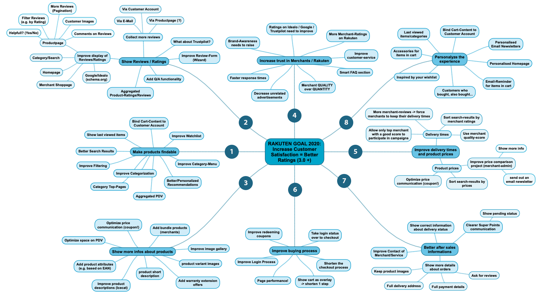
Understanding the Problem
Starting from the shopping cart to the checkout process wasn't easy. And also, Rakuten was a marketplace, not selling anything and also not involving the shipping process. This leads users to see final prices and different shipping prices, and the time between the shopping cart and thank you page was significant. Another problem was that our registered users who logged in could not smoothly go to the checkout process when they were already logged in from the marketplace. Finally, except for shopping carts, users couldn't change any quantities; they had to go back to the shopping cart, which led to lower conversion rates.


What did we want to achieve?
- Provide a seamless experience to our users by understanding placing orders easier
- Increase product conversion
- Reduce the time between the shopping cart and to thank you page
- Improve the personalization with order-related product recommendations
- Free up time in customer service and help to increase the level of service quality for our customers
- Increase overall experience for new and returning customers
- Better responsive design for mobile customers
Research
Situation Analysis
Customers need a more accessible option to go back to the marketplace and see other products and sometimes need to keep their products to save for later. When we talked with customers, we got some answers.
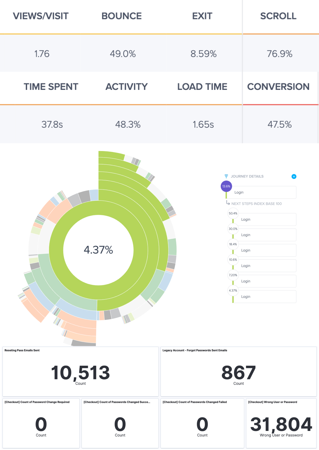
They cannot see shipping information clearly in the total cost. One of the reasons for cart abandonment in e-commerce is: "I couldn't see/calculate total order cost up-front." When we checked the data, we saw that the bounce rate was 49%, and the exit rate was close to 9% in the shopping cart. We can convert only 47.5% of our customers from the shopping cart, and 16% want to go back to see product details. This also showed us many customers have trouble logging in / registering. Users need to log in at least two times to order because of different systems on the marketplace and checkout. Even when they complete their order, nearly 70% of our users exit the platform after they buy a product and almost 11% of our users try to go to the customer account to see details.

Findings
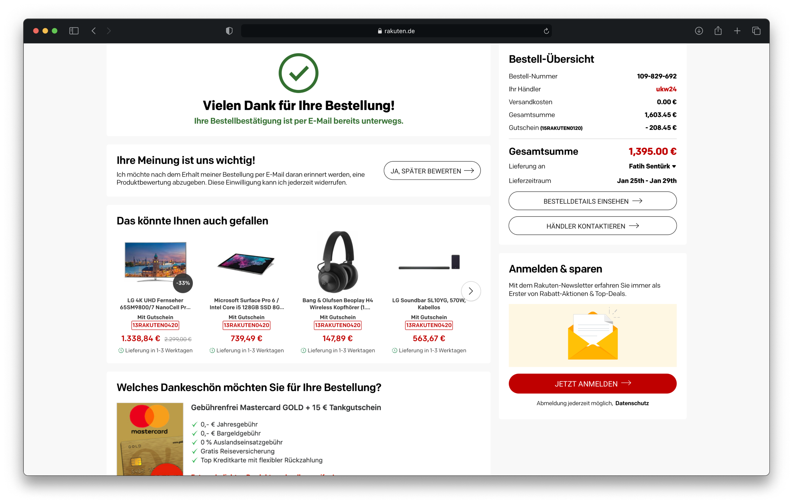
At this stage, after a bit of brainstorming and came up with a few ideas to resolve the issues uncovered during the interaction with the users. We wanted to start fixing problems first by converting guest users to registered members and second by solving issues on thank you page.
We are not giving our users a smooth experience to go back to the marketplace and look for other things or to look at their order details in the customer account.
We are not giving them a chance to go back and buy another item.
We want to free up time in customer service and help increase service quality for our customers. Most requests come after buying an item because of a lack of information.
Strategy
Nearly 70% of our users exit the platform after they buy a product, and almost 11% of our users try to go to the customer account.
Keep the users on the platform.
Show clear positive feedback that their order is successful
Show the critical order details to ensure the user everything is ok
Convert guest buyers to Club Members
Get their opt-in for review-reminders
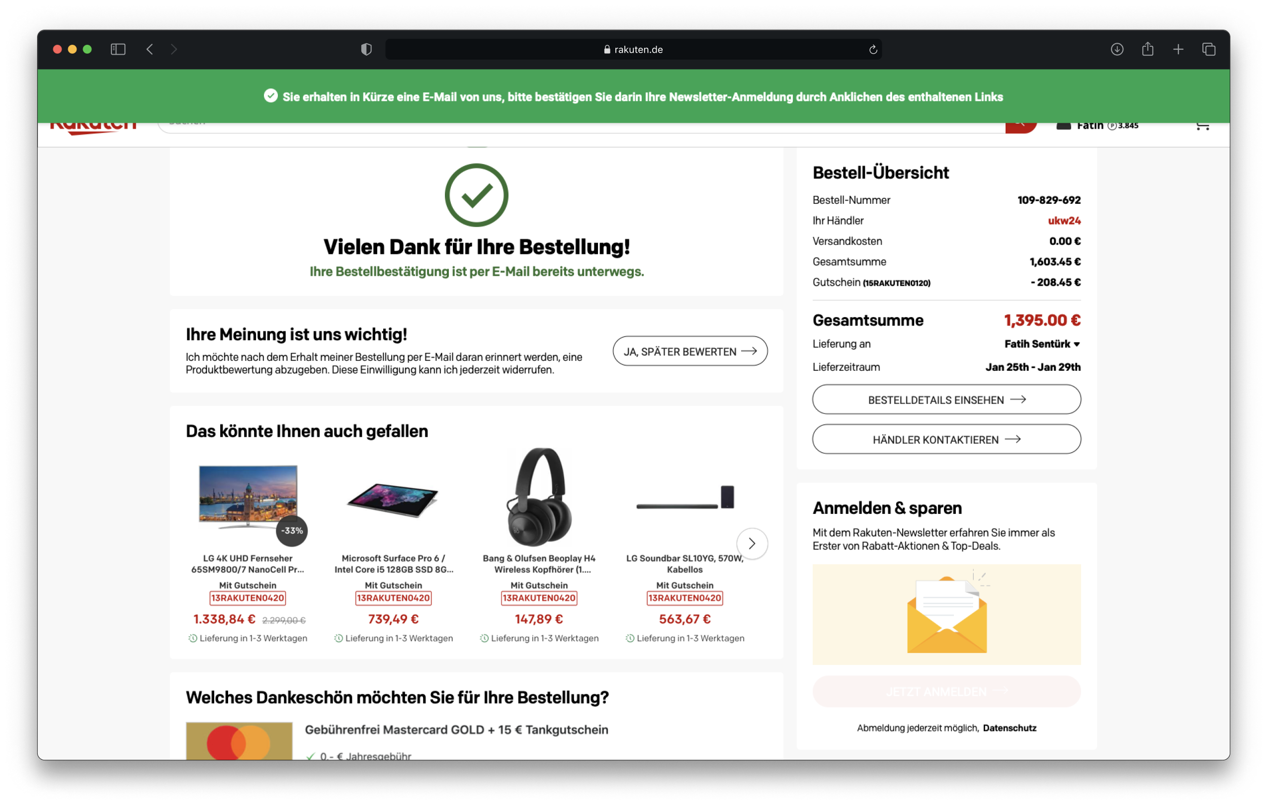
Get their opt-in for the newsletter
The possibility to tell friends about their experience (Invite Friends)
Give them a choice to buy another product in our marketplace.

Thank you page
User Flow
If it’s a guest user, we can give them an option for being a Rakuten Club Membership is helpful for them. That’s why we know their email address, and we can add a password field, and they can be a member.
We can easily suggest they access good deals if they have registered with our platform and do not opt-in to a newsletter.
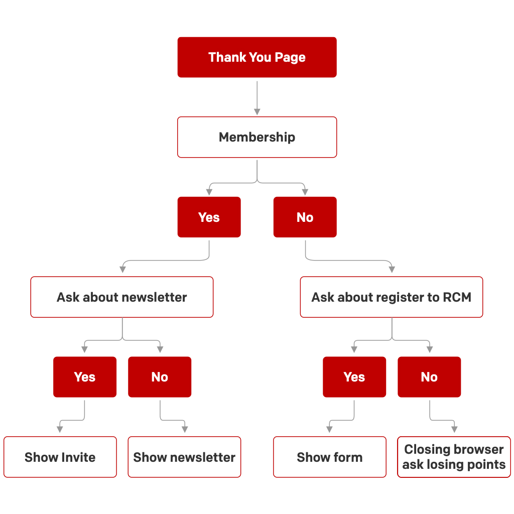
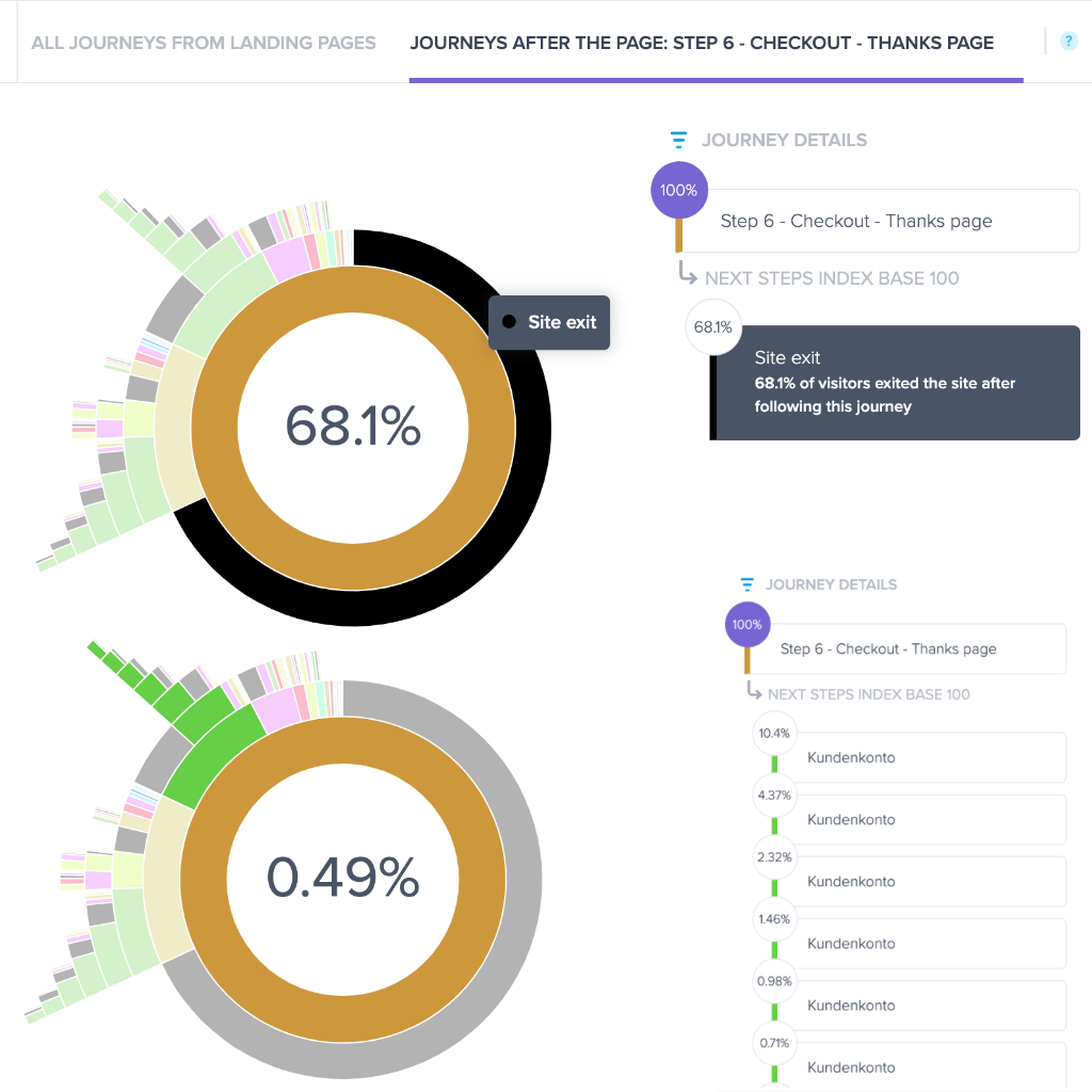
If they have already registered members and opt-in to a newsletter, we can give them an option to invite their friends, and maybe we can provide them 100 super points if their friend spent some money on our platform. We can increase our registered users and retention rates, and our users can be our advertisers.
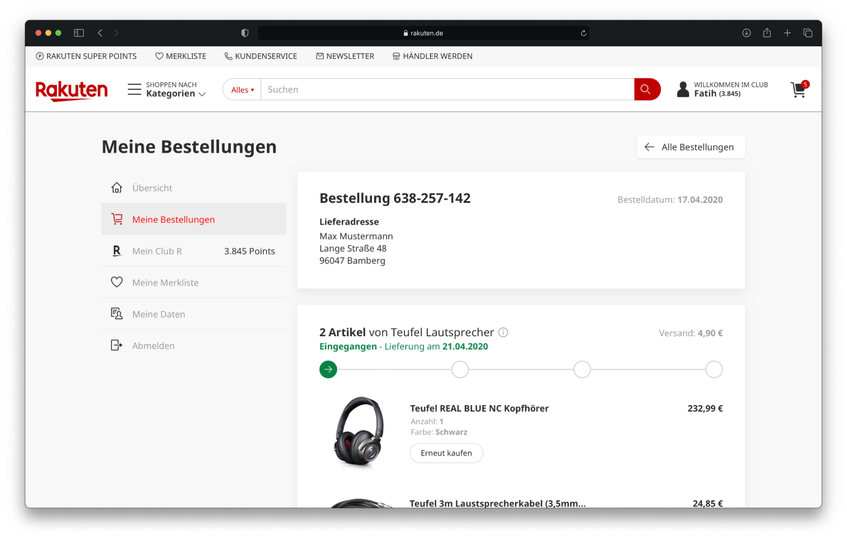
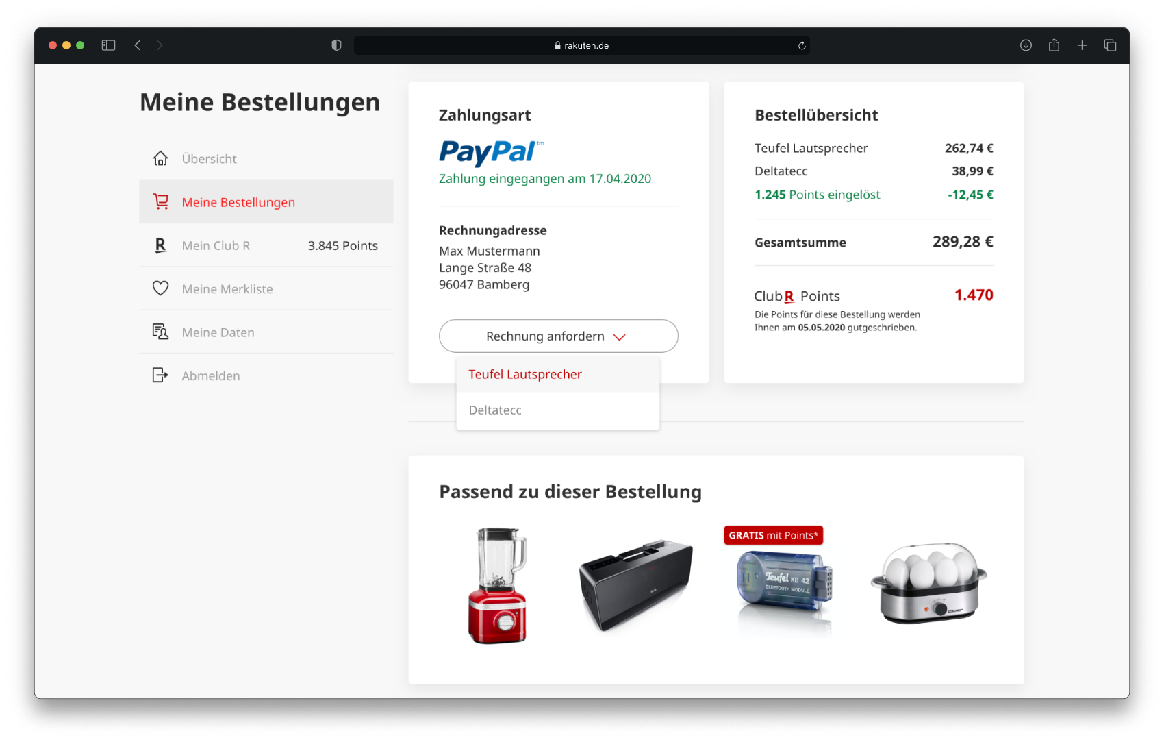
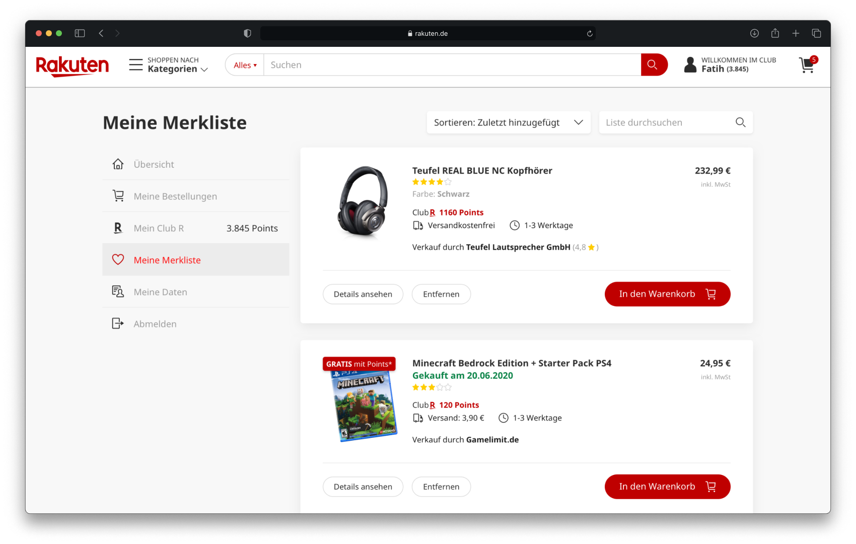
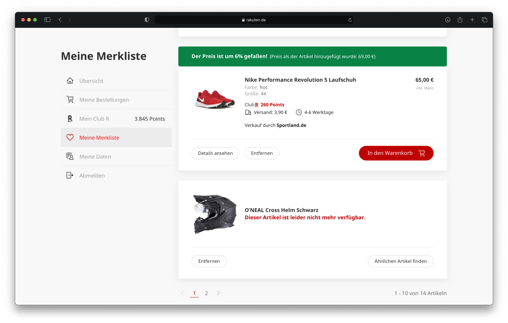
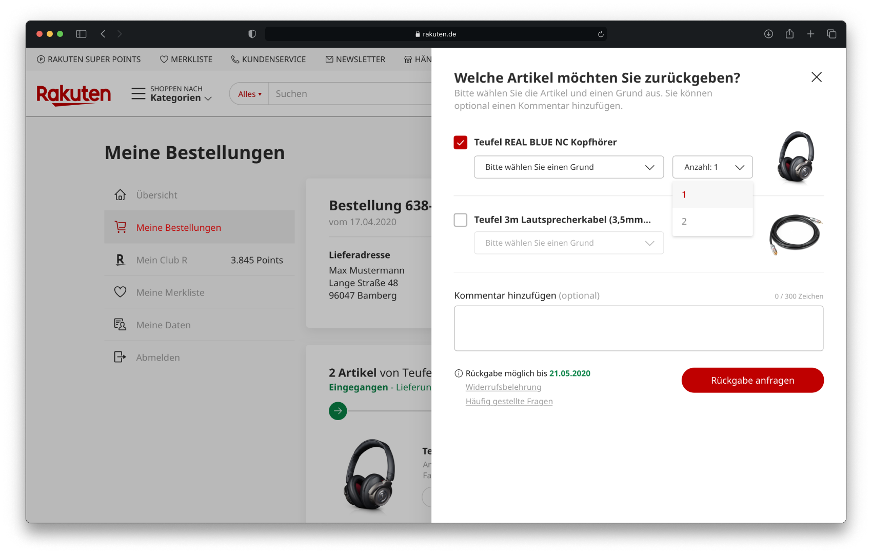
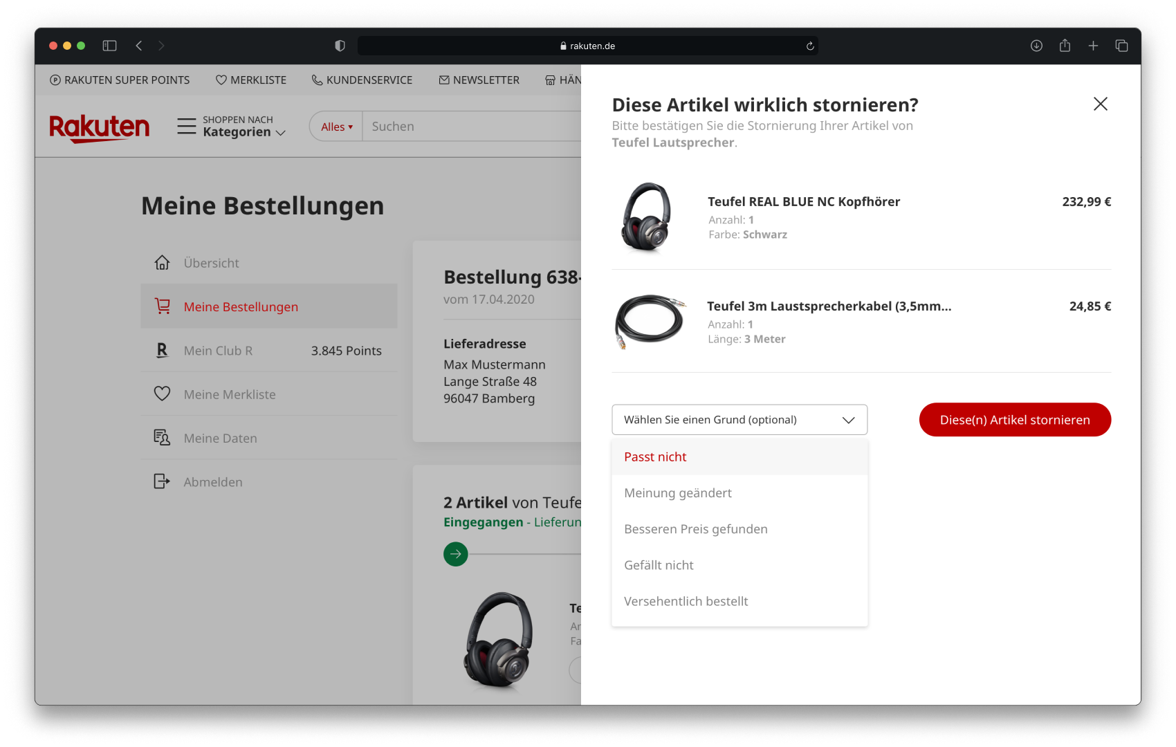
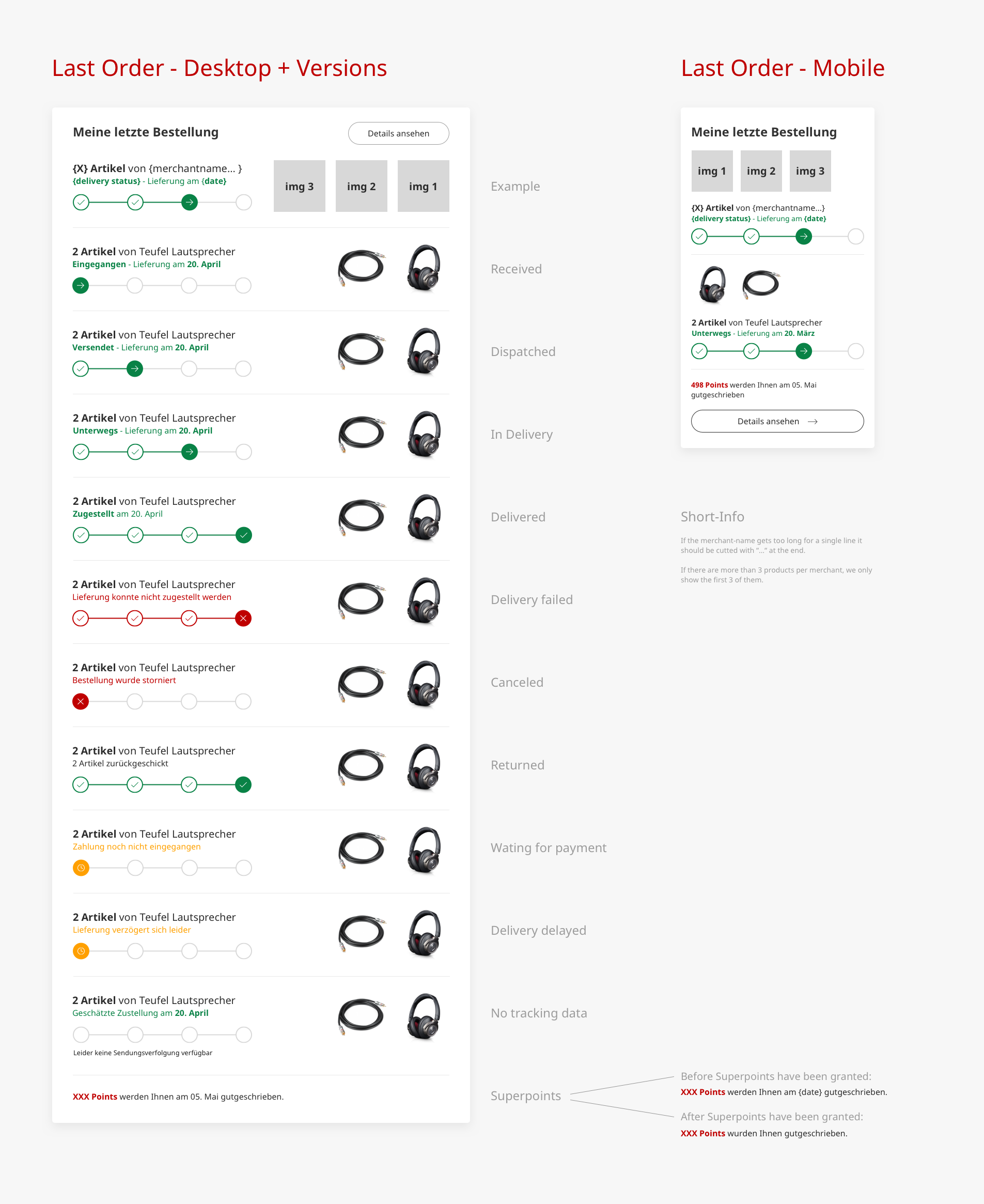
After solving thank you page problems, we focused on Customer Accounts to allow these customers to see essential pieces of information.
User Interfaces
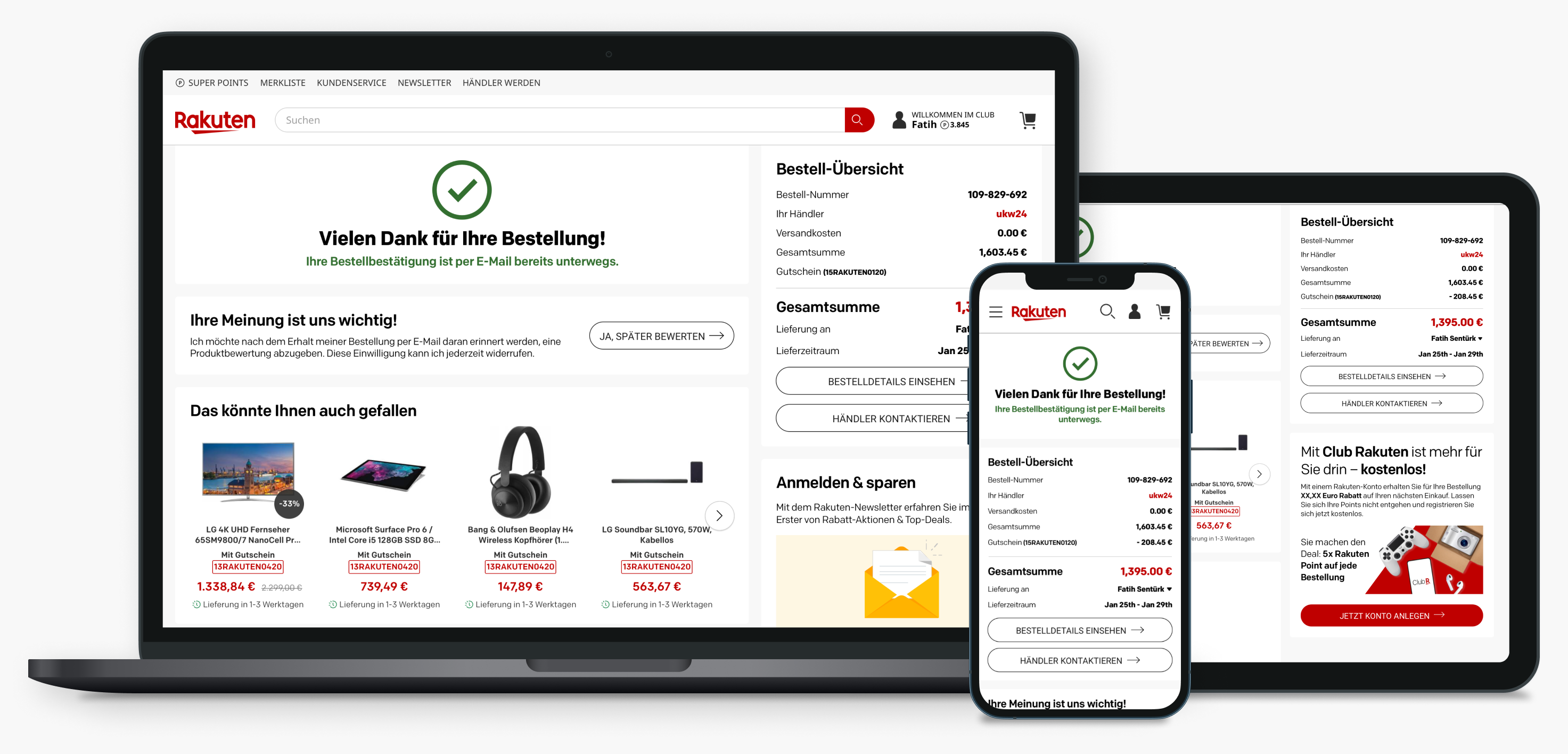
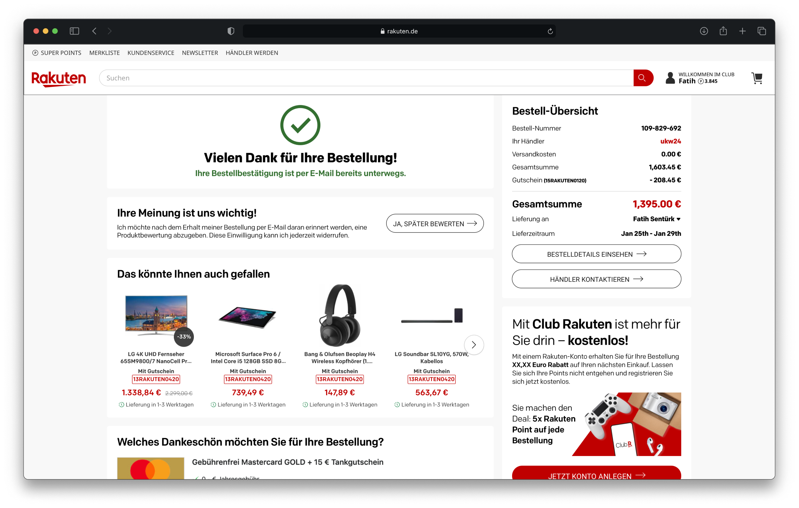
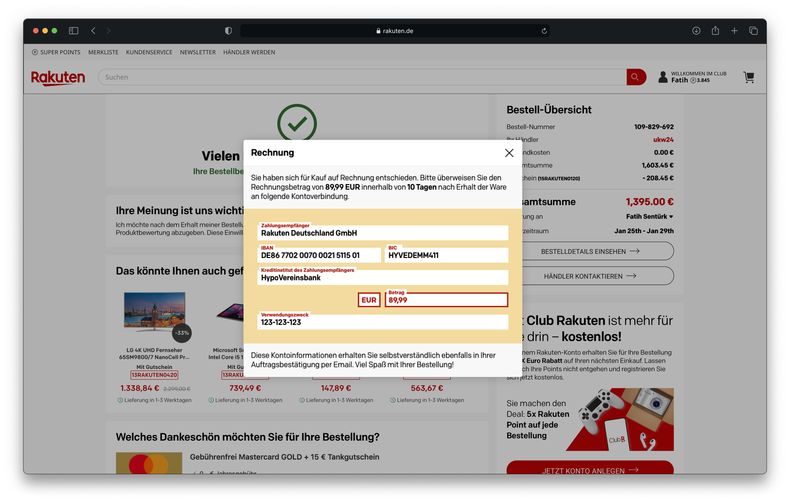
Customer Account Interfaces

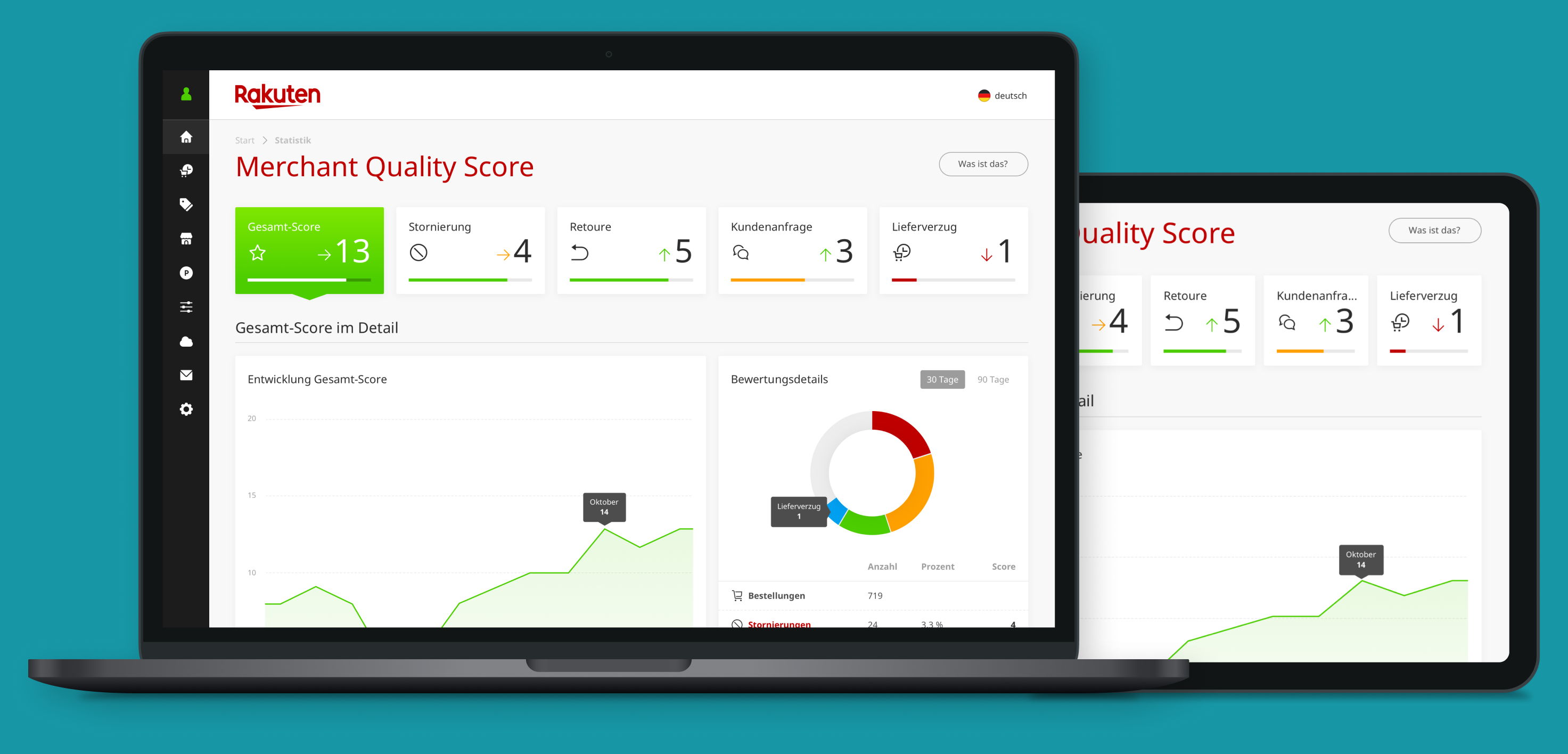
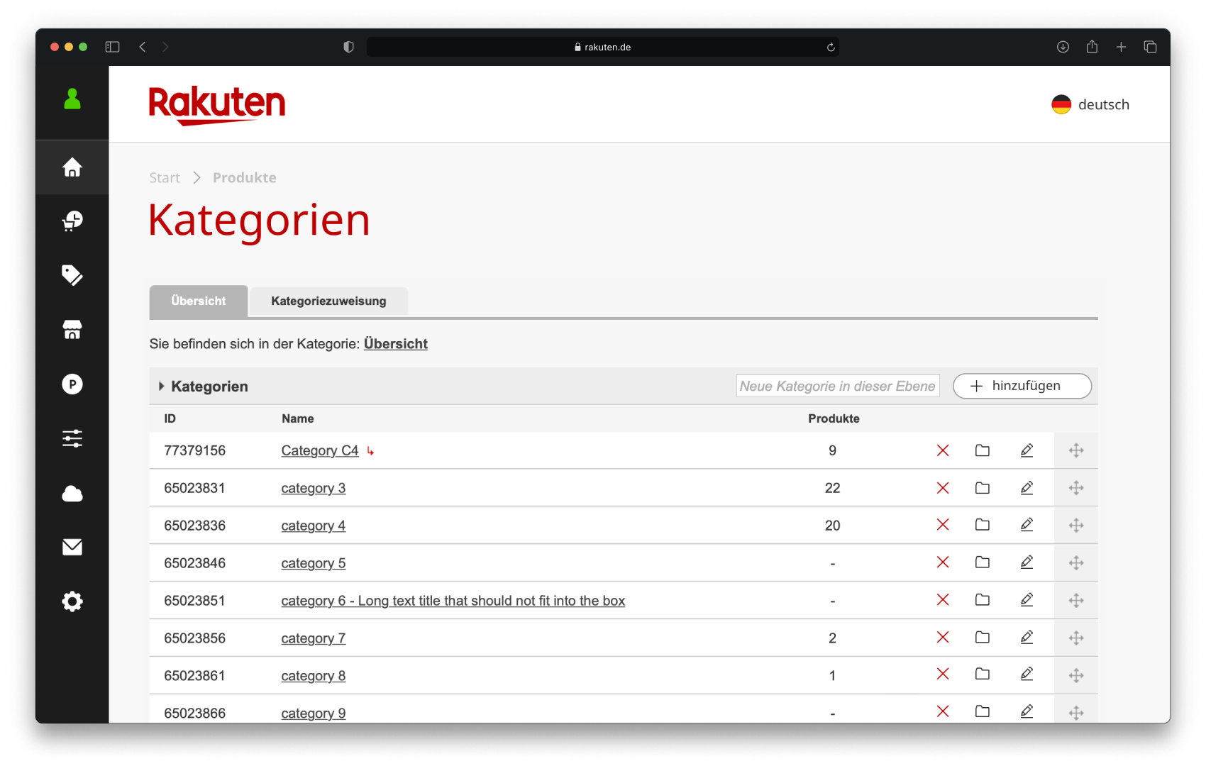
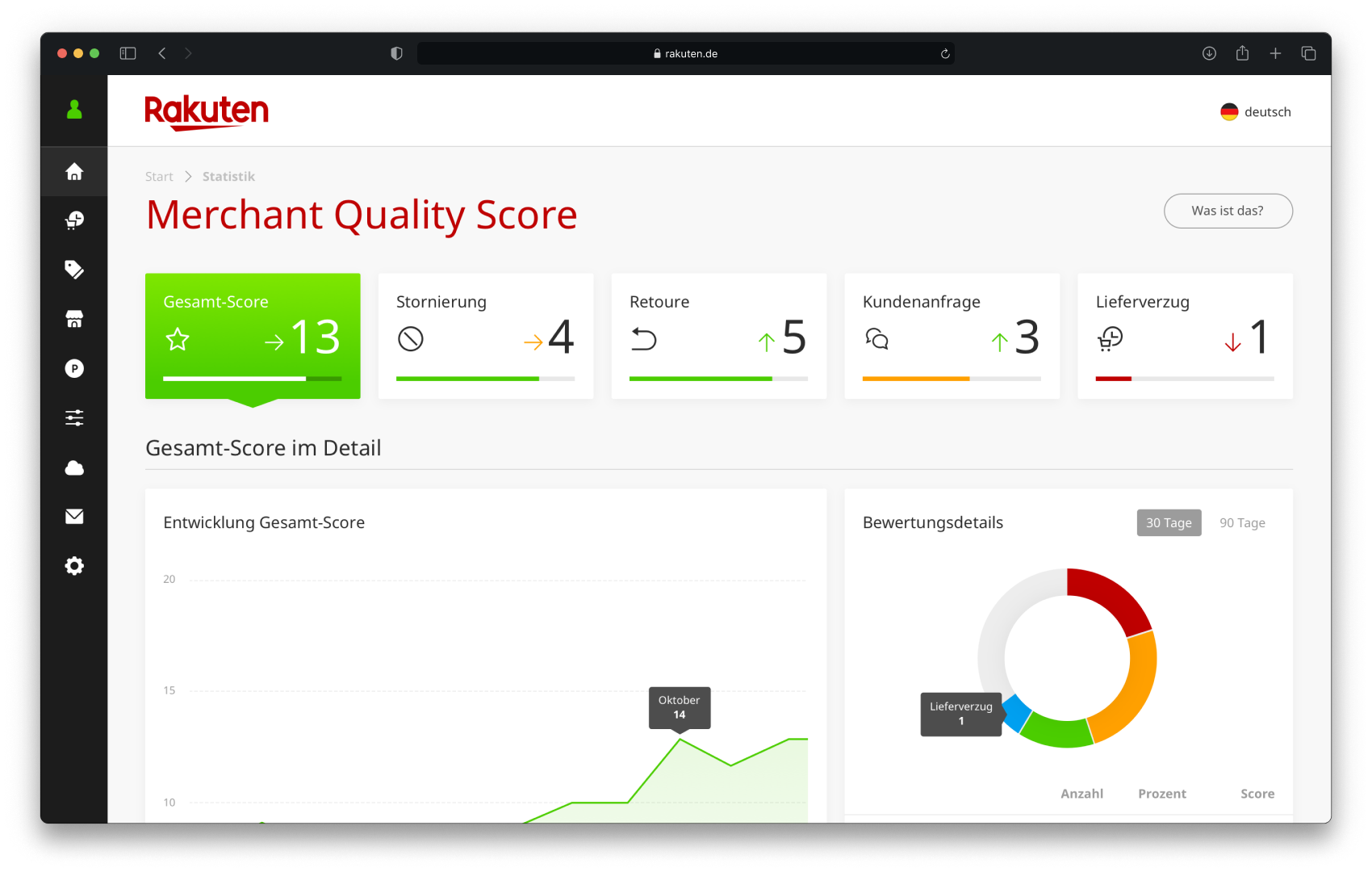
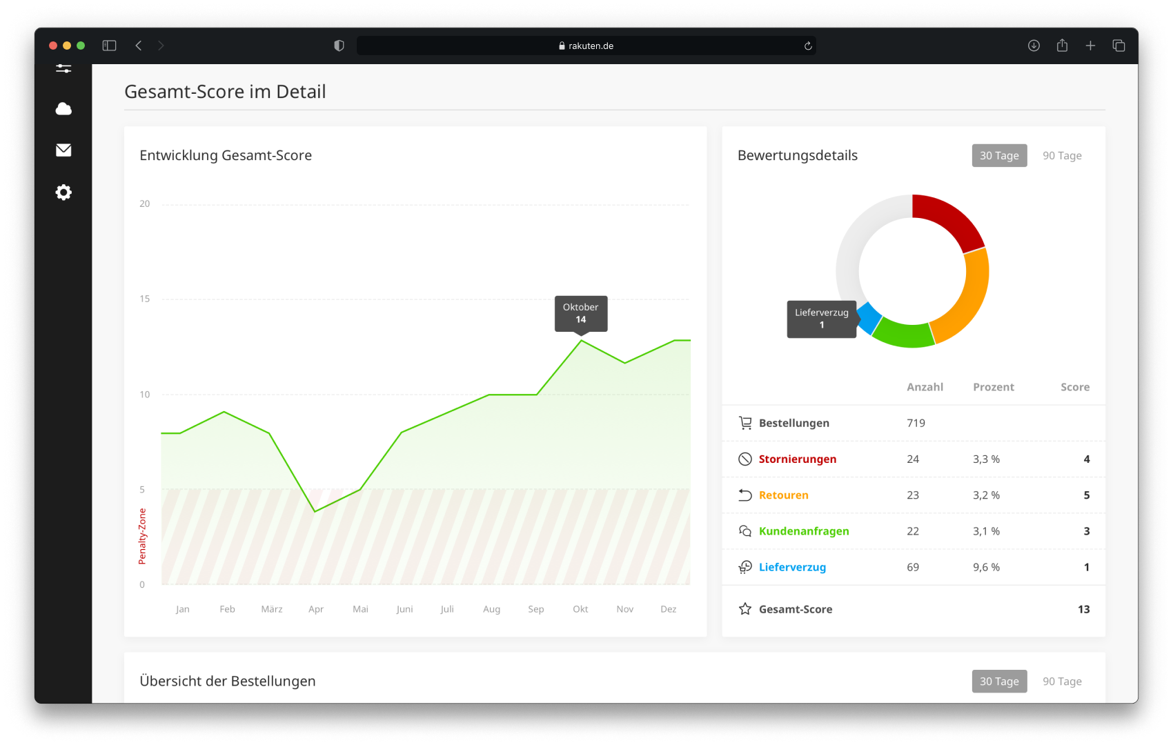
Merchant Backend Interfaces


Final thoughts
Unfortunately, many upcoming changes were suspended because Rakuten Japan decided to close the German marketplace. Shopping Cart, Checkout, and PDP changes were never made.
[email protected]
Amsterdam, Netherlands